Last updated:
‘Paper ambassadors: letterheads and the iconography of urban modernity’, Provenance: The Journal of Public Record Office Victoria, issue no. 13, 2014. ISSN 1832-2522. Copyright © Andrew J May, Stephen Banham and Christine Eid.
This is a peer reviewed article.
The decorative letterhead as an ephemeral visual source is part of the minutiae of daily institutional correspondence from which the historian can draw a clear sense of the interchanges of information and the vectors of knowledge crisscrossing city, continent and globe. This article will focus on a sample of letterheads contained within City of Melbourne records held at Public Record Office Victoria and consider the ways in which letterhead design and symbolism reveal the concerns of its citizens, display the material culture of the city, and legitimate certain ideologies.
Introduction
In February 1912 a small article appeared simultaneously in two regional Victorian newspapers extolling the virtues of ‘The Printed Letterhead’ for the go-ahead rural entrepreneur. The author was Professor WC Palmer, Agricultural Editor from the North Dakota Agricultural College, and his syndicated advocating of letterheads as ‘travelling advertisers’ to promote the sale of farm produce in the communities of southeast and southwest Victoria reflected a broader international trend in corporate advertising. ‘It looks like business’, trumpeted Palmer, ‘and it is business of the best kind’. Cheap and efficient, the letterhead as an instrument of public relations could be persuasive for a potential customer base as well as a source of pride for the farmer himself. Seeing his goods represented in idealised visual form on his stationery ensured he would take care in ensuring the consistent quality of the articles he advertised for sale.[1]
Denizens of the archive usually seek more substantial text-based content, and those illustrative sources commonly utilised by researchers most often come in the familiar forms of the photograph, map, painting, poster or engraving. But the paper empire of the archive contains much more elusive visual jewels. They are unindexed and cannot be easily discovered using finding aids or databases,[2] but most record series that include letter-based files will include examples. Printed historical ephemera gives the present-day viewer a transient but palpable sense of the past, and the preservation of formal ephemera collections has become since the latter decades of last century a signal attempt to represent popular as well as high culture artefacts.[3] The methodological implications of utilising visual materials as historical evidence have received growing attention from historians for over a decade,[4] and collection managers and information scientists have identified the potential of visual ephemera as throwing ‘new light on the time in which they were created’.[5] The humble letterhead as an ephemeral visual form, however, is rarely cited as a significant source of historical evidence.[6] This survey article draws attention to the usefulness of the letterhead as a source for the city historian while at the same time suggesting that future and more detailed case-study analysis will extend our understanding of this creative genre as a form of public relations, as one aspect of the broader armoury of brand identity, and as the product of transformations in commercial art and design history.
Like any other evidence, the decorative letterhead needs to be read with a critical eye – for the ways in which its creators idealise the world they depict; reflect their personal identities and ideologies as well as the mentalities and preoccupations of their age; or distort reality in pursuit of their own goals. The task of this article is to suggest some of the ways in which the letterhead as an everyday and seemingly mundane historical source is a ‘paper ambassador’[7] that can provide rich visual cues about culture. As a medium with its genesis in the roots of print culture itself, its transformation and impact is in many ways synchronous with the development of Australian printing from the early colonial period. As an artistic form, it might also indicate changing trends in visual language and graphic design that can only be revealed over a longitudinal sample. Furthermore, this article argues that letterheads become more complex visual and ideological markers of the transformations in urban culture that occur through the period of the second Industrial Revolution from the 1860s to World War I.[8] These changes are broadly manifest in the expansion of the railway and urban networked technologies such as sewerage, gas and water supply, as well as the invention and development of the telephone, electric power, elevators, trams, mass circulation newspapers, and the internal combustion engine. The growing iconographical sophistication of the letterhead correlates with the period of intensive and dispersed invention and innovation across the fields of transportation, chemicals, production engineering, communications technology, manufacturing, food processing and household technologies. As such they represent the products of urban modernity as well as in themselves being formative in the proliferation of knowledge, markets and desires around new types of products and services.[9]
There is perhaps no better place to demonstrate the utility of the letterhead as a historical source than in the voluminous correspondence files of the City of Melbourne (VA 511), retained across a number of Public Record Office Victoria (PROV) series including the bound registers of VPRS 3622 Correspondence Inward, Miscellaneous Letters (1842–1858), as well as VPRS 3181 Town Clerk’s Files, Series I (1842–1910) and VPRS 3183 Town Clerk’s Correspondence Files II (1910–1985). Melbourne Town Council was incorporated in 1842 (the same year as the first Sydney council), and Melbourne was officially created a City in 1849. The municipal corporation was given authority over civic affairs including markets, roads, sewerage, building regulations and street nuisances. All correspondence to the council crossed the desk of the town clerk who, depending on its subject matter, would refer each letter to one or other of the council’s officers or committees: the city surveyor, engineer or architect, or perhaps to the finance, market, hackney carriage or public works committee. A sampling of the riches of this municipal collection – as exemplary of a coherent and sustained historical holding of PROV – can provide the historian with an eclectic array of novel source material that might illuminate themes in Melbourne’s history including civic and corporate identity, business and industry, transport, entertainment and leisure, and other aspects of society and culture.
Civic and corporate identity
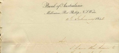
The first extant letterhead in the collection – and one of the simplest – is on a letter from the ‘Bank of Australasia, Melbourne, Port Phillip. N. S. Wales’ in early 1843, and must be one of Melbourne’s earliest. (Prior to Separation in 1851, Melbourne had of course been situated in the Port Phillip District of New South Wales.) A simple printed text-based letterhead such as this stands on the threshold of the coming age of corporate branding which would see visual advertising play a critical role in building brand equity and reputation. Names, symbols and slogans would be increasingly recognised as essential assets in product differentiation, and as the ‘signifying data’ of ‘internal brand building’ would draw the viewer/consumer into a particular relationship with the producer in increasingly sophisticated ways.[10]
If brand equity incurred a relationship of value between the producer and consumer,[11] the authority of government and legal authorities over their constituencies was further cemented through visual languages that rendered a traditionally understood rhetoric of power (for example, the wax seal) into new material and paper-based forms. Employing the conventional and conservative visual language of heraldry, many municipal council letterheads that were designed following expansion of Victoria’s civic frontier from the 1850s were intended to communicate an air of respectable authority. A symmetrical composition combined with shields, crowns, national emblems (including flora and fauna) together with mercantile symbols of industry are all consistent design features across this distinctly bureaucratic genre. Such letterheads might therefore be read as part of the official paraphernalia of local place marketing and sub-colonial boosterism, but also as symbols that reify the authority of government at its various levels. ‘Official records’ as Aradhana Sharma reminds us, ‘are not just annals of state facts but are also political artifacts that do not compile truths as much as conjure them’.[12]
Business and industry
But as Professor Palmer evangelised in 1912, the letterhead was, above all things, ‘a good business proposition’. Conversely, as the decorated letterhead reached its apotheosis in the interwar period, it was through the letterhead that ‘a business [was] often largely judged’.[13] With the rise of mass production in the latter decades of the nineteenth century and rapid modernisation in the early decades of the twentieth, letterheads heralded the goods and services of a burgeoning consumer class, and along with other types of trade and popular advertising played an important role in the circulation of consumerist ideas, the creation of taste, and the take-up of technological change and innovation. As more recent studies have shown, letterheads play a decisive role in the mechanisms by which brand identification becomes a proxy for quality.[14]
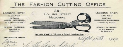
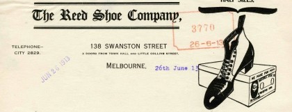
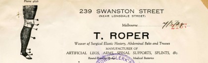
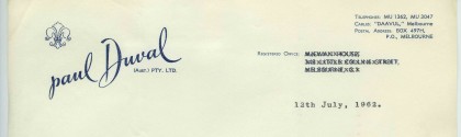
Prior to the age of complex multi-market corporations with their necessarily abstracted corporate identity systems, businesses would very often use a literal depiction (a picture) of an aspect of their trade. Optometrists would show a pair of spectacles, a fashion cutting office would feature scissors, a boot-maker would show a pair of shoes, and an artificial limb maker would depict a prosthetic leg.[15] The letterheads that featured the simple symbols of trade mirrored the familiar practice of the shop sign as the urban icon of the city street, from the pawnbroker’s balls, barber’s pole or chemist’s pestle and mortar, to large imitation objects hung outside shops and including a range of trades or wares such as boots, bells, hats, keys and anchors. Once competition began to develop, other design approaches were taken to differentiate brands in the marketplace. This saw the emergence of heavily stylised scripts in order to elevate marketplace status and infer a more personal interaction, such as the identity of Paul Duval cosmetics.
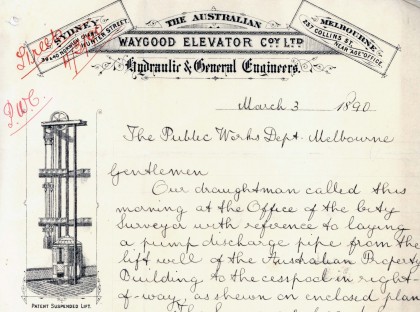
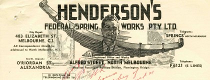
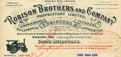
The industrial maturation of Marvellous Melbourne spurred on the growth of engineering and communications technologies including the passenger lift and the telephone. Firms such as Robison Brothers, John Danks & Son and the Australian Waygood Elevator Company prospered, as building the city meant heavy government investment in infrastructure and a demand for new products. For many of these companies the letterhead represented an ideal promotional opportunity – lavishly presented, often printed on both sides, incorporating decorative typographic titling and detailed illustrations of their machinery. Proudly displaying their patent suspended lift on their 1890 letterhead, the Australian Waygood Elevator Company greatly benefited from the land boom. Featuring an illustrative montage of a locomotive spring, a motorist and other symbols of technological modernity, Henderson’s Federal Spring Works’ 1947 letterhead was another showcase of industrial confidence.
There has been very little sustained attention from urban historians into the usefulness of using letterheads as sources. Over twenty years ago, Dominic Alessio drew attention to the ways in which the urban industrial landscape of Hamilton, Ontario was represented in various art forms, including photography and letterheads.[16] Alessio concluded that when the depictions of factories in letterheads were compared to those in photographs, there was a great deal of exaggeration in order to promote manufactured products and the scale of industrial plants. Industrial boosterism is also discernible in a range of visual tropes: smoking factory chimneys as indicators of progress; contiguous transport links that would enable the freight of raw materials as well as the speedy distribution of products; and highly organised and sanitised surroundings (as opposed to the disorderly environments that were often revealed in photographs). The depiction of the business premises, either as a lithograph or from the latter decades of the nineteenth century as a photograph, is perhaps the most popular image on Melbourne’s letterheads. Such depictions could skew reality, often making the buildings out to be more impressive than they may have been in reality, or editing out unsightly neighbours or street life. But in some cases they remain the only visual representation of a former shop or factory.
From the middle of the nineteenth century, businesses were slowly realising the advertising potential of more graphic letterheads in promoting their goods and services, though the heyday of the art form was perhaps in the post-Federation era. Melbourne’s letterheads display a vast array of consumer objects that reveal changes in fashions, superseded technologies, tastes in food and drink, and even household appliances. The most elaborate letterheads include not only basic information such as the name and address of a business or institution, the date and perhaps a cable or telephone number, but a variety of typefaces, highly elaborate ornamentation, and windows and breakouts that contain additional information from other products or services to lists of office bearers or even song lyrics.
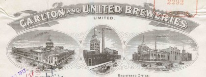
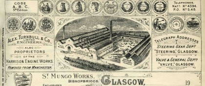
The symbolic meanings behind letterheads therefore not only reflect the values of business or industry in particular but also of the city and society itself. Looking across a large historical corpus, certain patterns and shifts can be witnessed, perhaps one of the most evident of these being the perception of ‘progress’. The early expressions of industriousness and progress represented by belching factory smokestacks would doubtlessly be interpreted by twenty-first century values as environmentally reckless pollution.[17] In other cases the emergence of new technologies such as telephones, cables, passenger lifts, electric lights and bells were specifically featured on letterheads to boast the progress, modernity and visionary aspirations of the city. Smoke billowing from chimneys at CUB’s Carlton, Yorkshire and Victoria breweries was a visual reminder in this letterhead of productive industry. The Glasgow factory of Alex Turnbull is depicted in 1907 with all the confidence of the Empire’s industrial heartland. Smoke billows productively from chimneys, while the yard is a showcase of merchandise. In an era when steam was still king, the firm solicited orders for its patent products from across the globe.
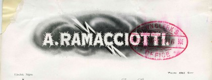
Dramatic symbolism reflecting power, strength and reliability was used on the letterheads of Melbourne’s energy companies. To truly appreciate the arrival of electric-powered illumination one has to recall that its introduction was nothing short of a technological revolution. In the early twentieth century, Melbourne’s shopkeepers were no longer satisfied with the traditional form of shop signs, and they sought out flashing electric roof signs to promote their businesses. To the dismay of the electric sign industry Melbourne City Council did not permit sky signs under their 1916 building regulations. By the time of A Ramacciotti’s 1916 letterhead, light was being used for purposes other than just the lighting of streets and other public places; it was being used for advertising to create a sense of public spectacle around a product or service by using a medium that people still held as a symbol of modernity and progress. At first glance, the visual language of this letterhead may be reminiscent of a magician or circus show (aided by the ‘exotic’ sounding name), but considering the almost ‘magic’ properties and potential of light in the minds of the public, it seems a perfectly appropriate and dramatic way to visually communicate the wonder of electrical signage.
Transport and communication
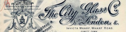
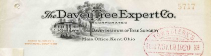
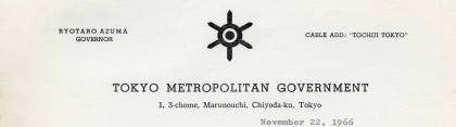
A French automobile firm anticipates the substitution of animal traction by motor traction in 1908; a London glass company spruiks its light globes in 1912; an Ohio tree surgeon notes his novel methods in 1920; and in 1966 the Governor of Tokyo recommends a visiting official researching welfare administration. Letters to the City of Melbourne came from all corners of the country as well as from overseas.
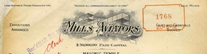
The development of aviation conquered Australia’s great ‘tyranny of distance’. Air races, long distance flights and ‘flying machine’ demonstrations contributed to the enthusiasm, progress and public spectacle of bird-like machines in the skies high above Melbourne. The depiction of an aeroplane was a symbol of the future. Aviation brought people together from across the globe, and with it a new sense of internationalism. Seeking to promote flying machines in Australia, Mills Aviators of Chicago wrote to the mayors of Melbourne and Sydney in 1912 for information and contacts in their respective cities. In this letter the aviation firm refers to the letterhead as testament to their business.
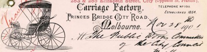
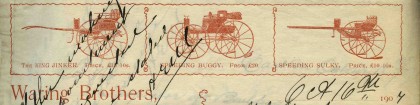
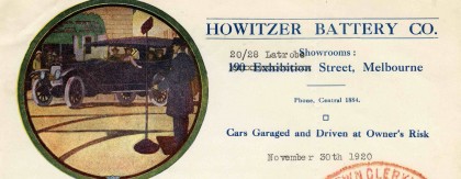
Since the 1830s horse-drawn vehicles were a popular mode of transport in Melbourne and took the form of omnibuses, cabs and coaches. Over time the diversity of carriages reflected changing social and fashion trends as well as technological advancements. The style and quality of carriages, as well as the number of horses, were markers of social status, as only Melbourne’s elite could afford to own them. Carriage and buggy builders, such as Thomas Craine, flourished during the 1880s. The letterheads for such businesses included detailed illustrations of the range of carriages for sale – King Jinker, Speeding Buggy, Speeding Sulky – or the horse and buggy service for hire, expanding its use as a promotional device. With the motor car came aspirations of prestige, power, freedom and modernity – all of which were aptly depicted in the motoring company letterheads through the use of official crests, detailed illustrations and the use of the relatively new printing process – photography. Howitzer Battery Company was the Victorian agent for the American car Chandler Six. Letterheads at this time used the language of endorsement. Earlier that year Howitzer advertised their car in the Argus, employing an official letter endorsed by aviation expert Sir Keith Smith.
Entertainment and leisure
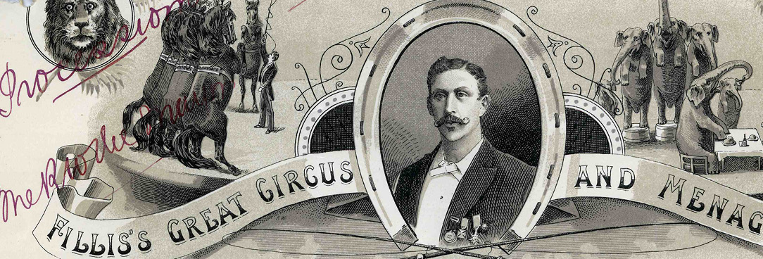
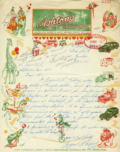
As Cabarga notes, the ‘art of the letterhead is most spectacular in its application to the entertainment industry. Here color and spectacle are not just gratuitous hyperbole but a reflection of the shows they illustrate’.[18] The letterheads of various local and visiting circus companies were as joyful and colourful as their big-top performances. Visits from such troupes as Hayes’ European Circus (1887), Fillis’s Great Circus and Menagerie (1893), FitzGerald Brothers (1902), and Ashton’s Circus and Zoo (1955) ensured that Melburnians were regularly treated to the latest national and international amusements, from clowns and daring trapeze acts to bareback riders, elephants and lion tamers. A feature of their visits would also be the spectacular processions down Swanston Street that often advertised the arrival of the circus in town.
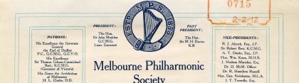
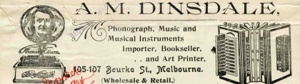
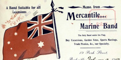
Entertainment also meant musical and other leisure pursuits. Musical culture was regarded as a cornerstone of middle-class moral values. George Leavis Allen – a founder of the Melbourne Philharmonic Society – came to Melbourne in 1852, and later formed the firm of music retailers and publishers Allan & Co. in 1881. Other firms like Dinsdale’s published and sold sheet music, from pantomime waltzes to a ‘White Australia’ song printed in 1910 and performed at the Australian Natives’ Association National Fete. Dinsdale’s also sold Edison records and machines. The Mercantile Marine Band marched under the colours of the Australian Red Ensign, a flag that was designed for the 1901 Federal Flag Design Competition. The band often played as entertainment on bay excursion steamers like the Hygeia that took pleasure seekers on day trips to Queenscliff, Portsea or Sorrento. The letterhead was clearly the perfect medium for performers to spruik their wares.
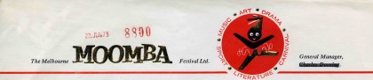
The Moomba Festival was inaugurated on 12 March 1955 as a joint initiative of the City of Melbourne and the City Development Association. Moomba took place on the old Labour Day weekend, and was a venture designed to reinvigorate a declining inner city and to attract Melburnians back to the centre. The name Moomba had its origins in the 1951 Aboriginal theatre production An Aboriginal Moomba: Out of the Dark, and while translated as ‘let’s get together and have fun’, has long had an alternative reading as an Aboriginal word for ‘bum’. The black-faced figure in the 1973 letterhead had subtly changed by the 1980s to a white-faced logo.

Society and identity
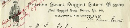
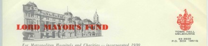
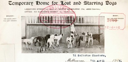
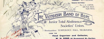
Colonial philanthropy was mostly organised on a voluntarist basis, with a profusion of hospitals, rescue homes, orphanages and other services run on church-based lines which all embedded their ideologies in the visual form of their letterheads. ‘Ragged schools’ had their origins in the English Ragged School Union, and were established in Melbourne from the late 1850s to educate working-class children through religious and practical lessons. The Lord Mayor’s Fund was instigated in 1921 as a centralised appeal that distributed money to a range of hospitals and other beneficiaries. The Lost Dogs Home was established in North Melbourne in 1913, and animal welfare organisations lobbied for the protection of animal rights. Religious and moral campaigns continue to reflect contemporary debates over social and ethical issues. The Band of Hope had been formed in Britain in the 1840s as a temperance organisation to warn children about the evils of drink.
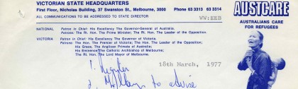
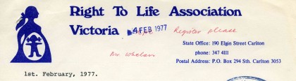
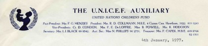
What better way to communicate the importance of a charity than by putting a human face to it? By showing the faces of those whose plight is the focus of the charity, the viewers are more likely to respond with empathy and support. An Austcare letterhead is perhaps the most graphic of these. Produced just after the end of the Vietnam War, it is an alarming and direct piece of graphic design. Accompanied by lines of pragmatic Helvetica, the message of the letterhead is made very clear indeed. Also striking, but perhaps less confronting, are the graphic uses of silhouette in the Right to Life Association Victoria and the Unicef Auxilary letterheads.
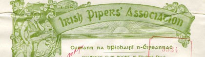
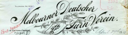
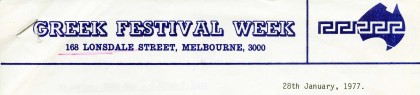
The tensions of a dual identity as both British and Australian have long obsessed Melburnians and Australians more generally, and many letterheads are replete with the icons and symbols of ethnic identity. In the nineteenth century the Scots became the third largest immigrant group after the English and the Irish, and became prominent in city affairs including politics, business and the media. A range of associations were established as a way of maintaining a sense of cultural heritage and identity, including the St Andrews Society (1846) and the Caledonian Society of Victoria (1858). Despite the city’s predominantly Anglo–Celtic roots, nineteenth-century Melbourne was also a popular destination for Germans, the largest non-British group of settlers. The Melbourne Deutscher Turn Verein (German Association) was founded in 1860. Greek immigration to Melbourne exploded between 1947 and 1987 when a quarter of a million Greek-born migrants made Australia home.
The letterhead as design
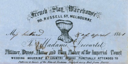
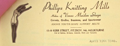
The advantage of analysing the depiction of material products over time is nowhere better revealed than in a comparison of two illustrations of women’s corsetry. The hourglass figure shown in an 1861 letterhead of the French Stay Warehouse in Russell Street, and its coding of nineteenth-century stereotypes of women’s beauty, contrasts markedly with the idealised female form 80 years later, represented in a Phillips Knitting Mills letterhead from Fitzroy in 1940. Other letterheads can also be read with particular gender stereotyping in mind, including the idealised figures of the woman as both weaker sex and moral guardian.
Running in tandem with the social, industrial and political expressions of Melbourne’s evolution from the 1840s into the twentieth century, letterheads also tell us a great deal about the creative spirit of the city. The history of the letterhead embodies the history of technologies from the Industrial to the Digital Revolutions, from the origins of the printing press and papermaking machines to lithography, photoengraving, typesetting machines and photography. But letterheads are more than just ink on paper. They reflect the changing world of design. The heavily embellished correspondence of the Victorian era can be easily matched to its fussy contemporaries in architecture and industrial design. Through its design, the letterhead connects to a larger cultural expression, be it the striking visual expression of national confidence at the time of Federation, or the arrival of modernism, signalling social and industrial progress emphasising design functionality.
Transformations in letterhead design over the nineteenth and twentieth centuries reveal a broad shift from a literal visual language to one of minimalism or abstraction.[19] Printing, lettering and design styles and techniques (such as embossing or multicolour printing) come in and out of fashion, mimicking broader cultural aesthetics and movements (such as Art Nouveau from the 1890s) and drawing on a much larger range of typefaces from the 1870s and ‘an expanded vocabulary of picto-symbols’.[20] Letterheads are deployed ‘to create a wide range of atmospheres: the dignity proper to a professional firm such as architects or lawyers, the substance of a steel company, the smartness of a dress shop, the exclusiveness of a dance studio’.[21]
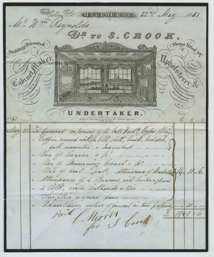
An early Victorian example of the visual language of the letterhead can be seen in the densely decorated 1855 billhead of cabinetmaker, upholsterer and undertaker S Crook which is embellished with symbols including native fauna, freemasonry and a funeral procession. As a related graphic form, the decorated billhead often replicated the visual grammar of the letterhead and is a distinctive primary source for commercial history.[22] Classically Victorian in its copious embellishment, Crook’s billhead presents an orderly symmetry to the viewer. The typographic composition suggests a professional hierarchy – that his main profession was that of an undertaker while other endeavours, cabinet-making and upholstery, are presented quite literally as ‘side-lines’, flagging the main illustration. Beyond the lush framing of this salon vignette, almost every inch of this letterhead is occupied by a rich combination of flowery flourishes, formal copperplate titling and the neo-medieval lettering favoured during this period of historic pillage. Crook was also a manufacturer of coffins, and this elaborate billhead addressed to William Reynolds lists expenses incurred for the funeral of Frederick Eiles in 1851. The image was drawn by lithographer Thomas Ham, who in 1843 had engraved Melbourne’s corporation seal and who also lithographed some of Victoria’s first stamps and banknotes. The room is like a stage that frames the city, for which the letterhead acts as a prime example of boosterism and parochialism. It is decorated with images including native fauna, the freemason’s square and compass, an Aboriginal figure, and a view of Hobson’s Bay. Through the window a funeral procession can be seen making its way to the cemetery, then located on the site of the present-day Queen Victoria Market. The flagstaff that signalled ships in the bay is visible through the right-hand window.
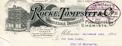
The embellished nature of the typography in a 1921 Robison Brothers letterhead (the use of illustrated scrolls, flourishes, dense shadowing and ornamental capitals) harks back to the firm’s establishment in the mid 1800s during the Victorian design era despite still being used in this example, some seventy years later. Their decorative letterhead featuring typographic flourishes, and highly detailed and precise illustrations of machinery, not only promoted their products but also displayed their creativity, precision and technical proficiency. Like many businesses during this period, a strong graphic emphasis was given to two key features of the Rocke, Tompsitt & Co. letterhead – the artful crafting of the main titling and the obligatory representation of ‘bricks and mortar’ as an indicator of strength, reliability and trust. The former is a rich flowing cascade of scripts, in-lined patterning, drop-shadowed letters and layers of fussy detail while the latter shows a striking corner property of a multi-levelled stature – an important symbol of modern building technologies at the time.
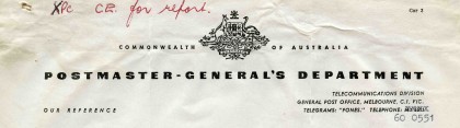
In a final example, one of the most symbolic and public arrivals of graphic design modernity to Australia surrounded the splitting of the office of PMG (Post Master General) in 1975 into two distinct entities. One of these involved the postal service and was re-titled Australia Post while the other related to telecommunications, which became Telecom. The pioneering work of Dutch-born graphic designer Pieter Huveneers in applying what he termed ‘total design’ to these two institutions ensured that they were both given strong and definitive visual identities. A letterhead from 1961, however, shows the more formal origins of the PMG, here represented by the Commonwealth of Australia coat of arms sitting over a long line of sturdy bold sans serif titling. What this letterhead shows the viewer is how much of a fundamental change was about to occur in the visual representation of Australian organisations during the later half of the twentieth century, namely the shift away from the heavy, official and symmetrical traditions.
Conclusion
A more comprehensive historical analysis of letterheads can only benefit the historian of the city in any attempt to develop a clearer understanding of the material culture, social relations and cultural aspirations of its inhabitants. As a small sampler of the riches of the collection of Public Record Office Victoria, this article has sought firstly to affirm the general usefulness of the letterhead as a historical source, and secondly to demonstrate that the increasing complexity of the iconography of letterheads in the half century or so from 1870 can illuminate the material foundations for new modes of thinking about urban space and time in this formative era of Western modernity. It is an irony that it is only in the twilight of a medium that its significance is seen with greater clarity. Such may be the case with the letterhead. In its printed form, the medium of the letterhead is certainly in decline. While its communicative role has been taken over by the efficiency of the email and with its promotional virtues now served by the ubiquitous website, the letterhead leaves a distinct shadow in the history of graphic design and visual communication. Its archival presence is also arguably more durable than its successors. In an age when forgotten aspects of urban memory are popularly being reclaimed through an interest in visual iconography, historical brands and locally-based institutions,[23] the letterhead provides endless interest for the city historian.
Endnotes
[1] WC Palmer, ‘The Printed Letterhead’, Camperdown Chronicle, 29 February 1912, p. 6; Gippsland Times, 29 February 1912, p. 6.
[2] Denise Driver and Sophie Garrett, ‘Creation of a Victorian frieze’, UMA Bulletin, no. 28, January 2011, p. 7.
[3] Richard Stone, ‘Junk mail: printed ephemera and preservation of the everyday’, Journal of Australian Studies, vol. 58, no. 22, 1998, pp. 99–106.
[4] See for example Peter Burke, Eyewitnessing: the uses of images as historical evidence, Reaktion Books, London, 2001; Ludmilla Jordanova, ‘Approaching Visual Materials’, in Simon Gunn and Lucy Faire (eds), Research methods for history, Edinburgh University Press, Edinburgh, 2012, pp. 30–47.
[5] Hermina GB Anghelescu and John H Slate, ‘Visual ephemera: A selected bibliography’, Collection Management, vol. 25, no. 4, 2001, p. 77.
[6] For fleeting references to the letterhead as a source of historical evidence, see: James T King and Andrew Cairns, ‘“I take this opportunity to inform you…”: The gold rush letters of Andrew Cairns’, California Historical Society Quarterly, vol. 46, no. 3 1967, p. 213; RP Mawby, ‘Reflections in ink: A study of local mining letterheads and letters from 1911’, Journal and Proceedings, Broken Hill Historical Society, vol. 20, 1984, pp 16–22; Antoine De Baecque, ‘The allegorical image of France, 1750–1800: A political crisis of representation’, Representations, no. 47, Summer 1994, pp. 134–6; Cameron Binkley, ‘“No better heritage than living trees”: Women’s clubs and early conservation in Humboldt County’, The Western Historical Quarterly, vol. 33, no. 2, 2002, p. 195; Drew W Crooks and Bill Alley, ‘Searching for Edward Lange: An early artist of Washington State’, The Pacific Northwest Quarterly, vol. 95, no. 4, 2004, p. 217.
[7] Leslie Cabarga, Letterheads: One hundred years of great design 1850–1950, Chronicle Books, San Francisco, 1992, p. 17.
[8] See for example Vaclav Smil, Creating the twentieth century: technical innovations of 1867–1914 and their lasting impact, Oxford University Press, Oxford, 2005; Martin V Melosi, ‘The urban environment’, in Peter Clark (ed.),The Oxford handbook of cities in world history, Oxford University Press, Oxford, 2013, pp. 700–719.
[9] On the economics of consumption and the evolution of consumer culture in Australia see Robert Crawford, Judith Stuart and Kim Humphrey (eds),Consumer Australia: historical perspectives, Cambridge Scholars, Newcastle upon Tyne, 2010.
[10] Guy Julier, The culture of design, Sage Publications Ltd, London, 2008, second edition, p. 192.
[11] David A Aaker, Managing brand equity, The Free Press, New York, 1991; Munyaradzi Mutsikiwa, Kossam Dhliwayo and Clay Hutama Basera, ‘The impact of advertising on building brand equity: A case of Zimbabwean universities’, European Journal of Business and Management, vol. 5, no. 9, 2013, pp. 197–210.
[12] Aradhana Sharma, ‘State transparency after the neoliberal turn: The politics, limits, and paradoxes of India’s Right to Information Law’, Political and Legal Anthropology Review, vol. 36, no. 2, 2013, p. 309.
[13] Paul Carlyle and Guy Oring, Layouts and letterheads, text by Herbert S Richland, McGraw-Hill Book Company, New York and London, 1938, p. 97.
[14] Kevin M Yamamoto, ‘What’s in a name? The letterhead impact project’,The Journal of Legal Studies Education, vol. 22, no. 1, 2004, pp. 65–98.
[15] Andrew Brown-May, Melbourne street life, Australian Scholarly Publishing, Melbourne, 2008, p. 47.
[16] Dominic T Alessio, ‘Capitalist realist art: Industrial images of Hamilton, Ontario, (1884–1910)’, Journal of Urban History, no. 18, 1992, pp. 442–69.
[17] On the rise and fall of the factory image in Australia, see Robert Crawford, ‘Manufacturing identities: industrial representations of nationhood in press advertisements, 1900–1969’, Labour History, no. 84, 2003, pp. 21–46.
[18] Cabarga, p. 19.
[19] Penny Wolfson, ‘Pushing the envelope: An ephemera nut finds an unlikely treasure trove: letterheads’, Print Magazine, vol. 62, no. 5, 2008, p. 82. See also Rita Reif, ‘You could tell the “ism” by the letterhead’, New York Times, 31 March 1996, p. 38.
[20] Cabarga, pp. 7, 15.
[21] Carlyle and Oring, p. 97.
[22] Russell J DeSimone, ‘A survey of nineteenth century Rhode Island billheads’, Bartlett Press, Middletown, Rhode Island, Technical Services Department Faculty Publications, Paper 9, 2001, available at <http://digitalcommons.uri.edu/lib_ts_pubs/9>, accessed 1 May 2014.
[23] See for example Lisa Cianci and Stefan Schutt, ‘Keepers of ghosts: old signs, new media and the age of archival flux’, Archives and Manuscripts, vol. 42, no. 1, March 2014, DOI: 10.1080/01576895.2014.886514, pp. 1–14.
Material in the Public Record Office Victoria archival collection contains words and descriptions that reflect attitudes and government policies at different times which may be insensitive and upsetting
Aboriginal and Torres Strait Islander Peoples should be aware the collection and website may contain images, voices and names of deceased persons.
PROV provides advice to researchers wishing to access, publish or re-use records about Aboriginal Peoples